Sometimes it takes a different paradigm
How a product works is limited by the design paradigms it's built on.
It's usually best to stick with familiar software design paradigms that users understand.
For instance, designing a texting app that doesn't follow how chats typically work will strongly confuse people.
Products should feel familiar because adapting to change has its costs.
But, there are times when challenging these paradigms pays off. This is about those times when changing the design constraints can make incredible new workflows possible.
The magnetic timeline
Apple's Final Cut Pro 7 followed the traditional video editing approach, much like Adobe Premiere still does, based on the tape editing metaphor.
This meant arranging video sequences on different tracks, a workflow many editors are used to, but which has some limitations.
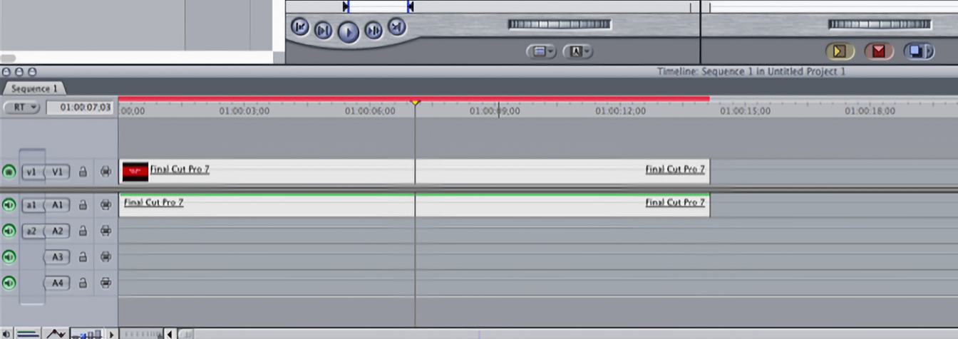
Randy Ubillos, creator of Final Cut: “Everything up through Final Cut 7 was really based on the tape metaphor. Source. Record. And individual tracks that are all completely independent.
As people worked on a project, it became easier to mess it up when you change something. If you had an hour-long project, people didn't want to do anything at the beginning of the project because it would change something 10 minutes downstream. Things just felt fragile, and that was because there were a lot of relationships between the items in the timeline that were in the editor's head.“
To make these relationships explicit, Randy Ubillos and his team decided to abandon the idea of tracks for the next version of Final Cut and create a new interface paradigm, based on gravity.
Dave Cerf, interface designer for Final Cut Pro X: “If you had all your clips as a bunch of little kids blocks, sitting on a platform, and you pulled out one out, they wouldn't close up. This was exactly the problem.
What we did is we took the concept of the blocks on a platform, and put it at an angle. And when you put the blocks at an angle and you take one of the blocks away, they do close up, because of gravity.“
This was the logic behind the magnetic timeline: an editing method where tracks manage themselves and clips move automatically to avoid overlap.
Moving away from the tape concept allowed Apple to redesign the timeline and introduce features like Auditions, enabling quick comparisons of edit variants that is only possible because the magnetic timeline can handle these on-the-fly changes.
The big shift initially turned a lot of existing users away from Final Cut Pro X. But it made an entirely new way of editing possible for many new people who decided to embrace the new paradigm.
HEY's screener
HEY reimagined email by questioning the fundamental idea that anyone can email you.
With HEY, first-time emails go to “the Screener“ for approval first. They've replaced the metaphor of a mailbox where anyone can send you a letter, which often leads to a bunch of unwanted promotional junk, with a new paradigm where you screen your e-mails like you screen your calls.
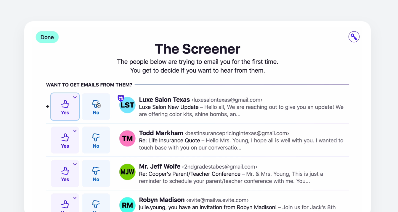
Since this is quite a shift from traditional e-mail services, HEY has to introduce the concept of the Screener during the onboarding process.
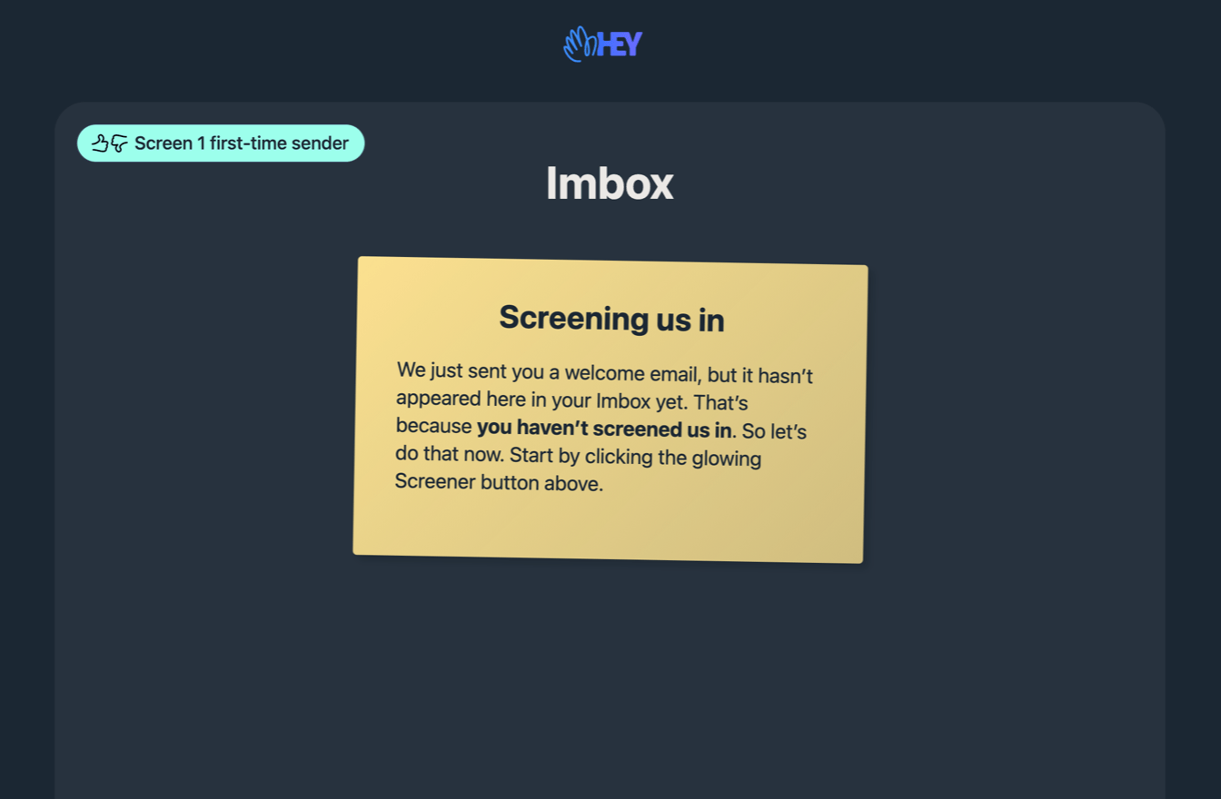
This adds some friction – and for a lot people, this will be too different from what they're used to. Yet, for those adopting it, it offers a novel email experience. It won't be the majority of people who use e-mail, but it gives HEY a meaningful place and “reason to exist“ in the market. It's a trade-off that works wonderfully for HEY, but wouldn't work at all for, say, Google.
A new take on accounting
Here's an example from my own work. Early in the design process of Infinity Finance, a Swiss accounting tool, we challenged ourselves with the task of making accounting accessible to anyone, “no MBA required“.
There were products out there for very simplified bookkeeping, but those were incredibly limited and most companies aren't even allowed to use them.
On the other side, we'd seen that beginners struggle with traditional full, double-entry bookkeeping software and often make mistakes because accounting takes a lot of time to learn.
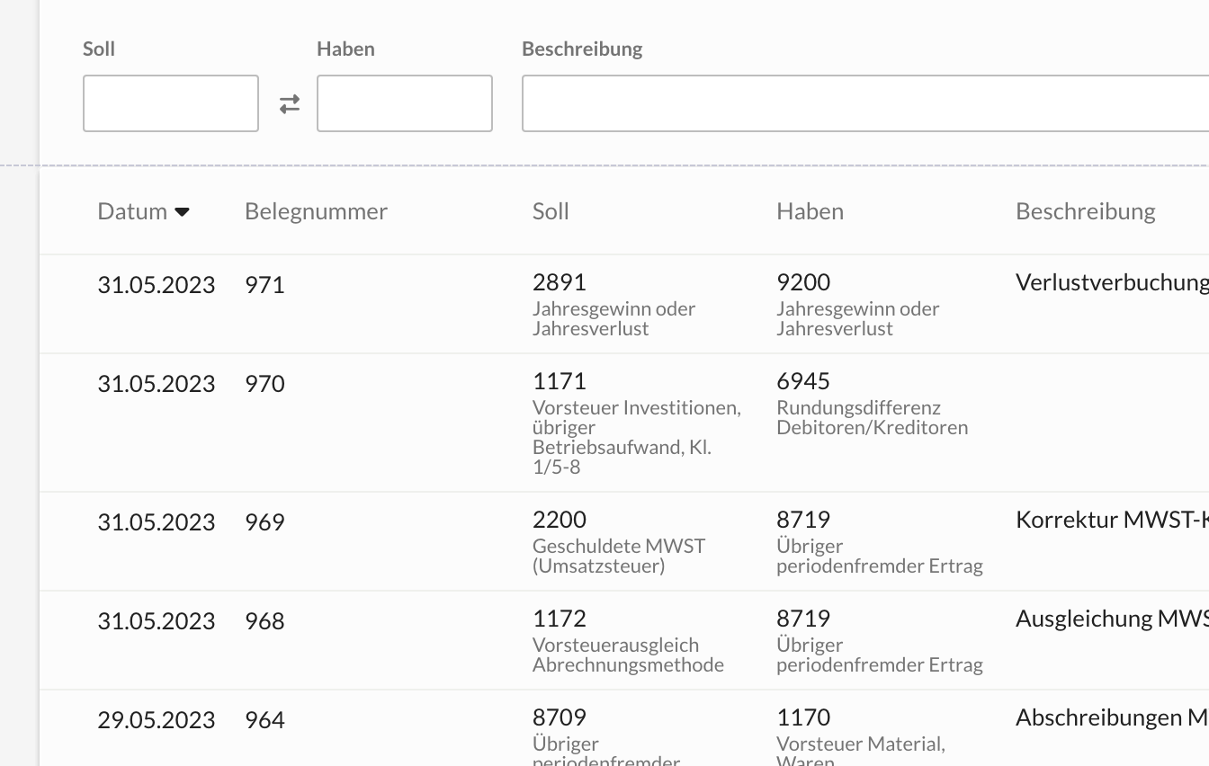
We wanted to bridge the gap. Make something that's as simple as possible to learn while still being a real accounting tool. Because that was not possible in the typical accounting paradigm, we built a new system that abstracted away the complexity from the user.
We built our ledger around the idea of the “account sheet“, which is a page that shows transactions within just one account at a time, with simple actions to add entries, instead of booking in a traditional journal that shows everything across all accounts.
Infinity Finance then determines automatically in the background how to handle credit and debit.
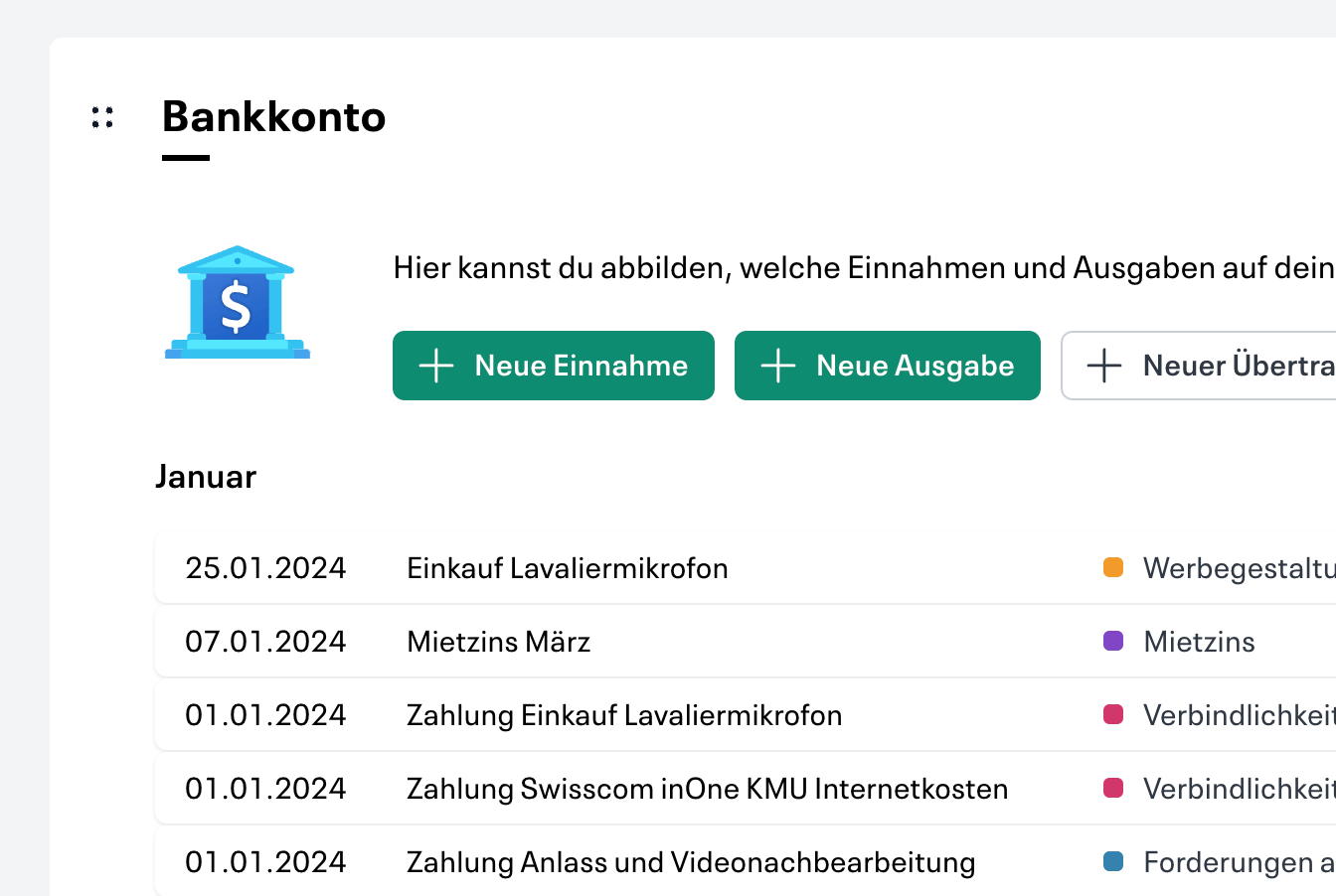
This is quite a different approach from all other accounting tools on the Swiss market. It has allowed us to confirm through usability tests that it's much easier to use correctly for beginners than a traditional full acounting system.
Embracing this new concept also allowed us to build in a live bank connection workflow with ML suggestions in a very natural and proactive way. New bank transactions just show up in the account sheet for review at the top.
Break when there's a reason to
When breaking from established paradigms, ensure there's a solid reason to do so. Unless the change makes a significant positive difference, people won't be eventually warming to it. Change for the sake of change just leads to frustration.
But sometimes it takes a different paradigm to make something new possible that just wouldn't be possible without.